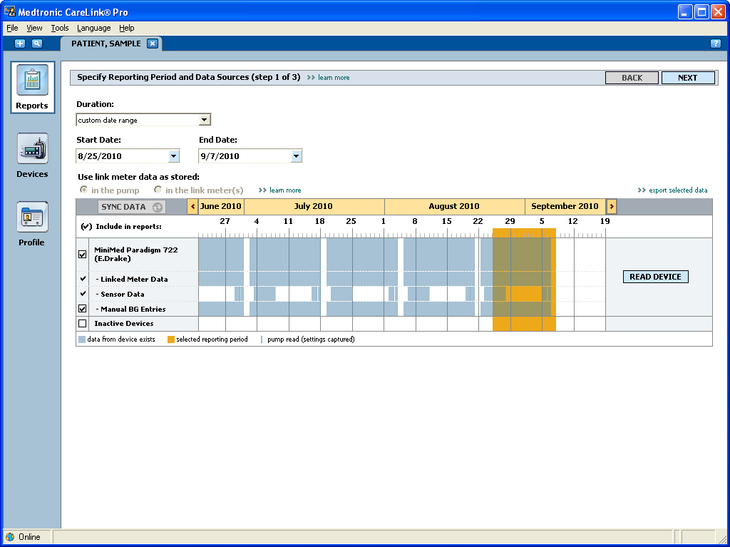
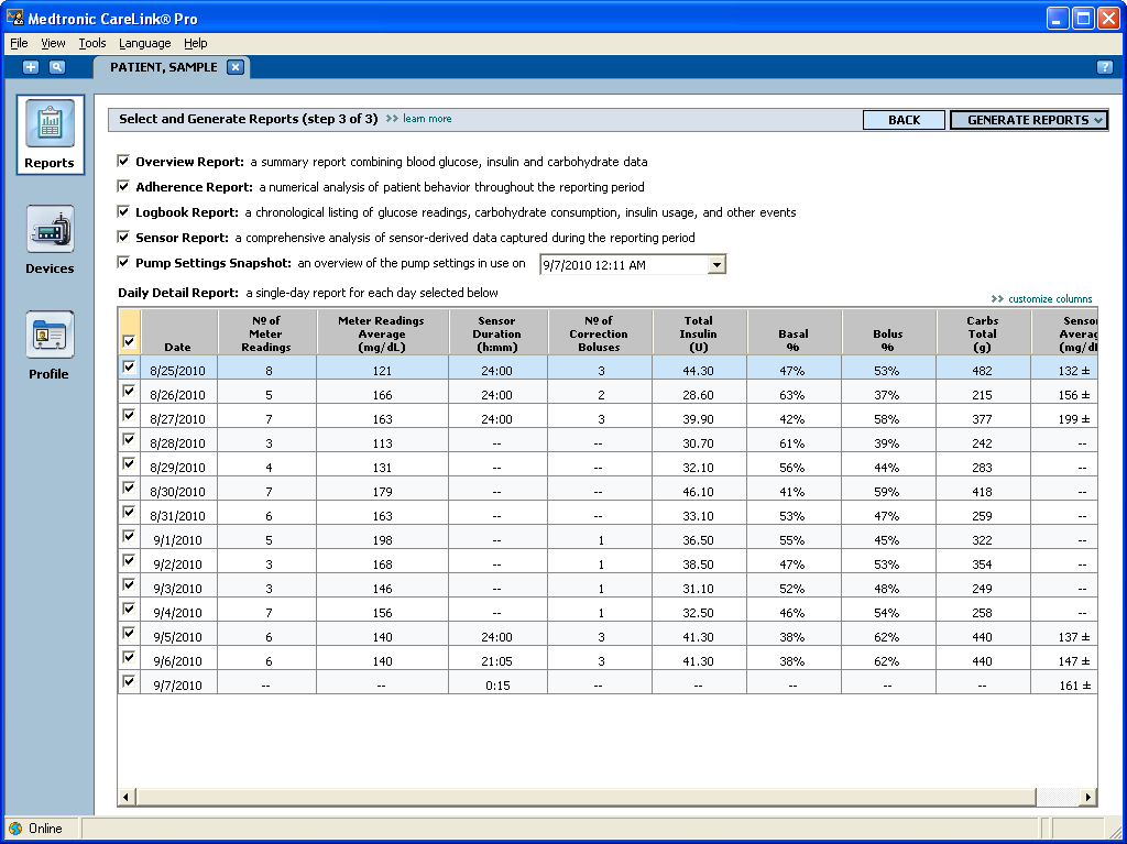
A patient with an insulin pump and a glucose monitor has health data positively streaming off of them, yet endocrinologists typically struggled with the reports they were given, often relying on cruder measures to make behavioral recommendations and rough adjustments to pump settings between quarterly visits. Direct research with five endocrinology offices, which later became a lead user program with two doctors in one office, helped us create a new set of reports aimed squarely at answering key clinical questions and showing patient behavior and results together.
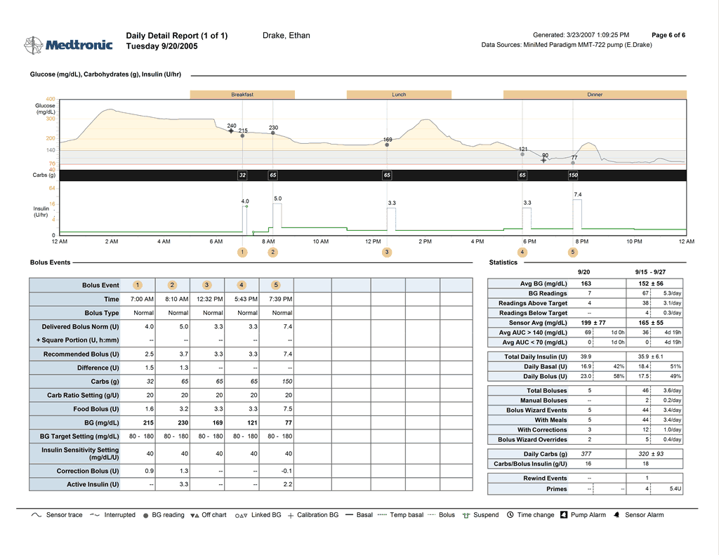
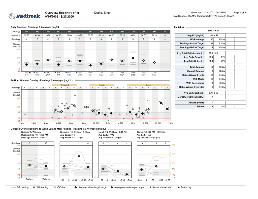
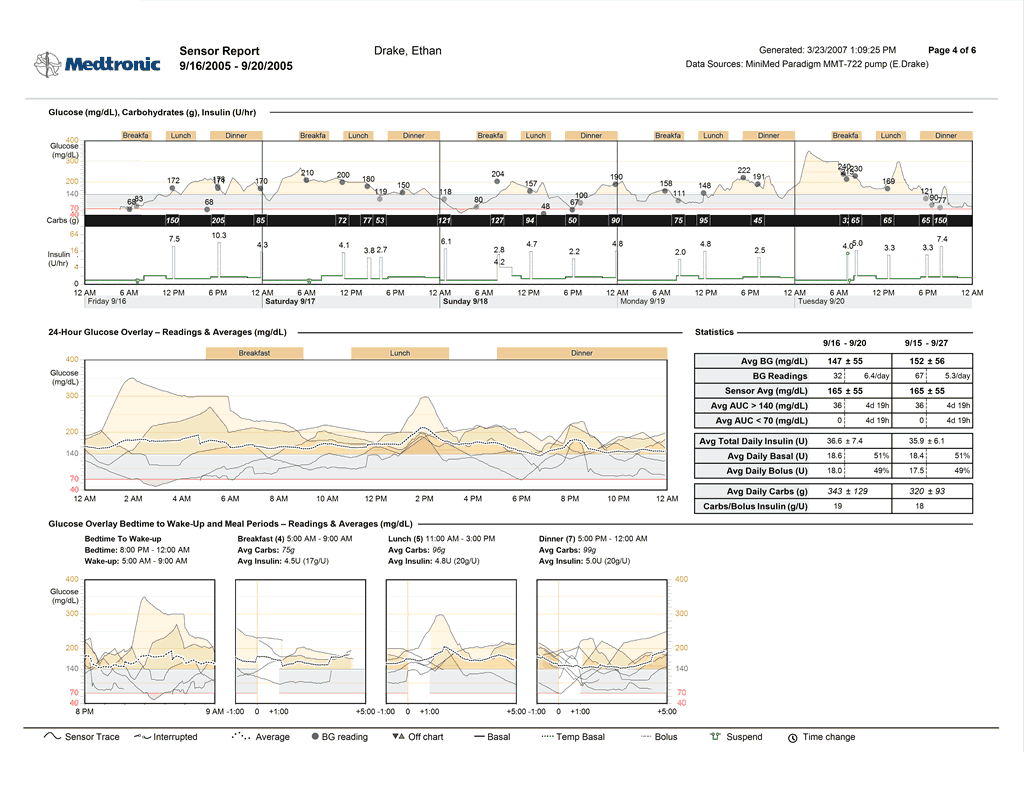


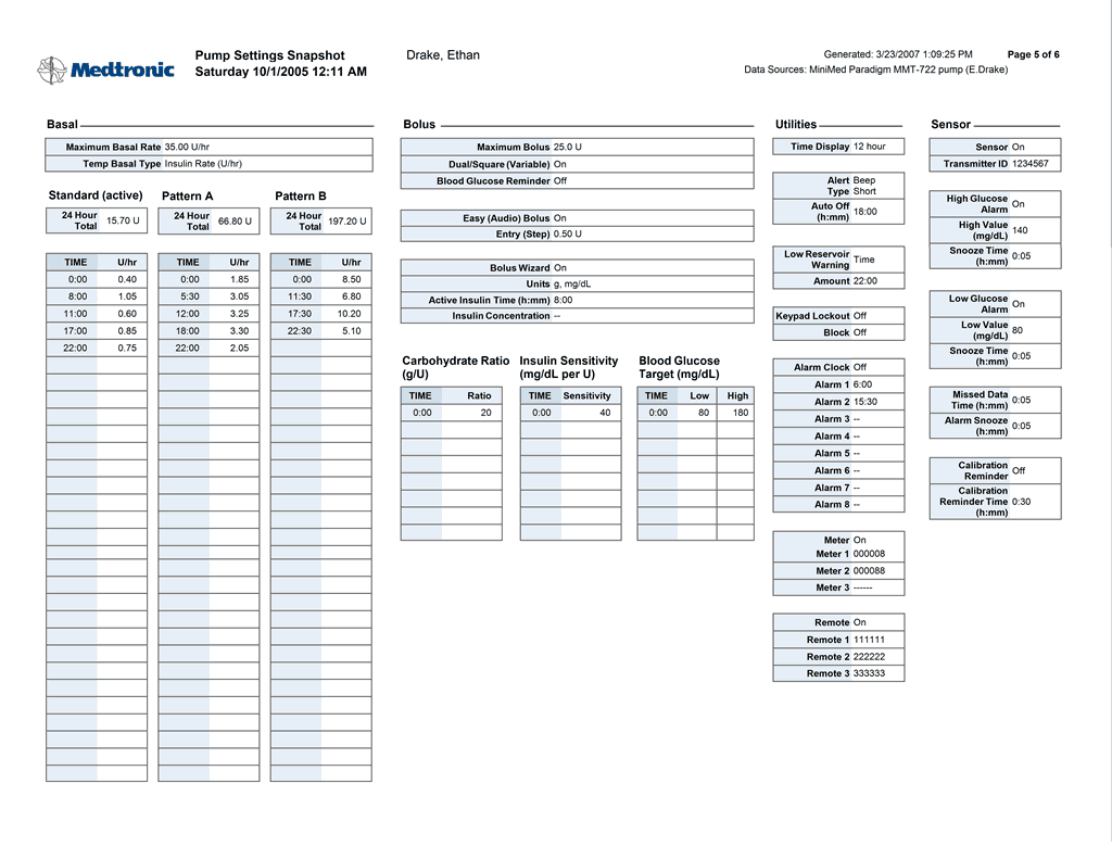
Central to these reports is the idea that as a patient takes more fingersticks the analysis should begin to approach that which is possible with a sensor; with a sensor a detailed train of behavior and results should be made clear and scannable.
New (and patented) at this time was a report detailing the adherence level of the patient, a key first glance that suggested to the physician how likely the later reports would be helpful.
Patents (of the type we called “amateur endocrinologists” during our research) have also come to love these reports that are aimed at professionals: https://rollinginthed.wordpress.com/2012/10/11/the-hook-brings-you-back/
My role: research, collection of live patient data, iterative design and testing of report design alternatives with endocrinologists and other physicians, functional specifications
Lessons learned: too-frequent contact with busy physicians can annoy them, but if you actually meet their needs they will adopt your product wholeheartedly and all will be forgiven. Physicians are smart and learned but can’t remember everything, so sometimes will have remembered outdated or incorrect lessons of the past. Leading them away from error with data and good design is more effective than arguing with them.

