Daphne writes:

I have near two year experience doing oversea marketing from a leading international NAS company called Synology. My role was devising marketing strategy and implementing it in our New Zealand and Australia market. (These two markets earn Synology over 1 billion revenue annually) I was the only marketing person who looks after these two area, so I have to run user/market research, devise product and content strategies, build campaign website with development, hold offline trade shows, perform copywriting, release product PR/ writeups and strategically distribute all the marketing materials to various channel outlets (including enterprise and consumer channels).

I came across UX in a marketing campaign where I design the website from scratch and attracted millions of impressions within two months. I realized that I’m interested in how experience shapes user behaviors, as well how they make decisions. By looking into users in both qualitative and quantitative lens, I hope I can play a more product-oriented role in a firm. That’s why I decided to pivot my career.

Thanks for reading these long paragraph and would love to hear any suggestions from you!

Hello, Daphne, Sorry about the delay. I read your note with interest; since you have some experience in product marketing you might be more ready than your peers to engage design goals at a higher level.

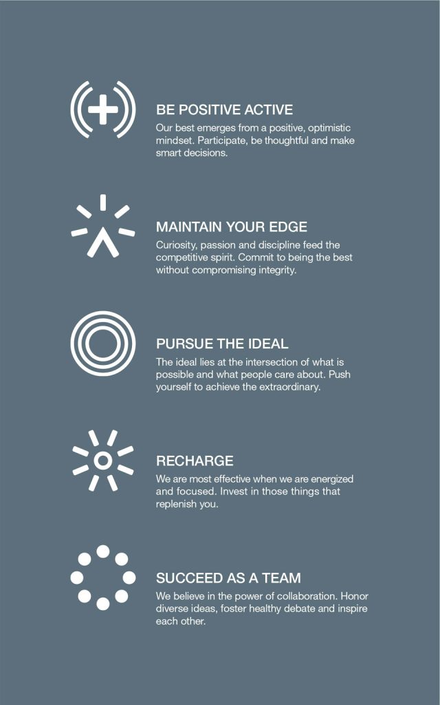
Design goals are the marriage of user goals and business goals. The ideal product, design, or business intervention brings success to the person being served and the business doing the serving.

In my early days at a past employer some product management leaders arrived from Procter & Gamble. They brought a method of product definition that changed the way I look at design. To hear them tell it, a solid product concept depends on some insight about a customer, some insight about the competition, and a way of delivering a benefit to that customer in a way that is informed by these insights and thus distinct from your competitors. It may not have a direct competitor at all, if your insights are insightful enough.

An insight is a statement of fact about a situation or behavior that is obvious in retrospect, but hidden or overlooked to most observers. An example: if you ask married men in the US why they shave their faces, they may say something about their spouses liking them to have a smooth face. But if you examine common shaving behaviors you’d see these same men shaving on weekday mornings before work, and letting their stubble grow on the weekend, just when they’d be spending the most time with their spouse. Clearly their motivation is elsewhere; it turns out that their behavior demonstrates that they shave to demonstrate a professional appearance at work.

A benefit is the result of having or using your product, expressed in general terms. It’s especially important that the benefit be a result, rather than a product itself. It’s also important that the benefit be expressed in general terms; the benefit could perhaps be delivered by means other than your product. In the shaving example, the benefit of a comfortable, smooth shave every morning could be delivered via a razor, or a shaving powder, or perhaps carefully-targeted lasers. The method is important, but the benefit does not state it.

I mention these product marketing concepts, benefits and insights, because interrogating them can usefully inform the work of product design and help others on the team, such as engineers and QA people, understand the intent behind the product being developed.

Asking about benefits and insights can also help you detect where research may be needed to strengthen the case for a product, to improve the benefit, determine how to demonstrate the benefit, or even where the product management is lacking. It’s common for newer product managers to rush headlong into assignments where they are asked to deliver a feature without really delving into the benefit that feature is meant to deliver. During design and development the forces of budget, timeframe, and technology can distort a poorly-understood benefit and put the design and development effort at significant risk. Attention the the benefit, why the benefit is relevant, and the various means available to you of delivering the benefit, can help you craft an intervention that is at the right scale for the business and really meets a customer need.

There’s one more product marketing concept that is important here: reasons to believe. A reason to believe is a fact about the product that helps the consumer understand that the product really will deliver the benefit it promises. RtBs come in many forms, such as endorsement (Kobe wears these shoes, the American Dental association recommends this toothpaste), explanation (a diagram of the product in use, a video), demonstration (see my white teeth), comparison (this router is 15% faster than the leading brand), proof (clinically proven to reduce cavities), a visible feature, a named feature, reassurance (money-back guarantee), or a testimonial (Joe here really enjoys his stump jumper).

If you are working on a feature for a product, and you understand the benefit, you can more easily give your user the scent of that benefit early in the interaction and demonstrate that you have delivered the benefit later in the interaction. This is just good design practice, but by asking the right questions you can get to a potentially successful design faster.

Velop whole-home WiFi system

The Velop Whole-Home Wi-Fi System is a collection of identical routers that work together to behave as a single virtual device, blanketing your home in fast and strong Wi-Fi coverage without the usual degradation in speed provided by traditional range extenders. They connect to each other wirelessly over dedicated channels, or can be connected via wire, distributing Wi-Fi radios and Ethernet ports around your home where you need them.

One Velop node is a very nice Wi-Fi router, and two or three will provide excellent range and speed for larger homes. To make setting up this multi-unit system as straightforward as possible we devised an app-based routine that detects available nodes and offers them to the user, walks them through the minimal wiring tasks necessary, detects their Internet settings, assists with the placement of nodes, and shows their network growing as they succeed in setting up each node in turn.

The industrial design is a strong counterpoint to traditional “dead bug” networking products, incorporating 360° design, thoughtful cable management, and a simple yet informative single LED indicator. This makes for a product that people don’t feel they need to hide behind furniture or in a closet. The tall narrow shape has a small footprint, yet elevates internal antennas for the best possible wireless performance.

My role: Software and firmware product owner, and leader of the UX, UI, Industrial Design, and Mechanical Engineering teams. Determined core experiential attributes of product, and served as Scrum product owner on multiple blended teams simultaneously. Developed software roadmap and co-developed hardware roadmap.

Lessons learned: Mixed product ownership is tricky, made less so when the co-owners have distinct areas of focus yet conspire to make a very nice product together. In volleyball one is often told to “improve the ball,” to make the job of those around you at least slightly easier with each touch. If co-owners do this they can make a fine thing, indeed.

Linksys app revitalization

At one point the Linksys app, meant to offer people setup, control, and monitoring of their Linksys networks at home, was rated below three stars on the iTunes Store and had a lifetime rating of 3.3 on the Google Play Store. A new information architecture, a fresh coat of paint, and many performance and interactivity improvements brought it to 4.5 stars on iTunes and a 4.1 lifetime on Google, helped by a judicious amount of review solicitation.

My role: Product owner, leader of the design team and cajoler of the software and firmware engineering teams. Substitute product manager for a somewhat neglected area. Part-time scrum master for design and blended design/development teams.

Lessons learned: The performance characteristics of the framework you choose to develop with need to align closely with the performance needs of your product. The framework is meant to make life easier for developers but needs to do so in a way that explicitly conveniences users. Said another way, the negative performance characteristics of the framework you choose better not matter to your users or you’ve magnified pain of development rather than reduced it. Asking otherwise happy people to review your app, infrequently, increases the recommendability of your product. A fresh coat of paint is not enough, but failing to give a fresh coat of paint once in a while enhances feelings of neglect, deserved or not.

WeMo smart home accessories and app

2013 IDEA Finalist, 2013 Silver UX Award

Wemo is a family of intelligent products for the home that allow you to control and see the status of switches, lights, and other devices, via your phone, from anywhere. We started with a plug-in switch module and a motion sensor, then quickly expanded to a power-measuring switch (Wemo Insight), a light switch, various LED lighting products, a heater, humidifier, and slow-cooker, and recently a dimmer. A smaller version of the original switch module, dubbed Wemo Mini, launched at the beginning of 2017.

My role: Made formative experience sketches for the product line that continue to govern the way the system operates, for better or worse. Formed the UX team with select members of my design staff and lead them into designing in a semi-Agile process in order to better integrate with the rapidly-forming software and cloud teams. Groomed one of their number to be the eventual UX manager for Wemo as a reorganization approached so I could turn my attention to rescuing the design and interactive components of the Linksys division.

Lessons learned: You must be clear what the core of your product is, lest you dilute your message in your eagerness to expand the product line. Inappropriate product partners make for messy divorces and disappointed children/employees. People notice if you fail to refresh visually, even as functionality continues to expand.

Belkin router out-of-box

An in-home study requiring participants to replace their existing router with one of three Belkin routers showed us that we had a lot of work to do. People surprised us at every turn, losing instructions, getting turned around in instructions, not understanding which cable was which, plugging things into the wrong places, etc. One nice lady even plugged the power supply cable into the headphone jack on her computer, because it sort of looked like it belonged there and she had missed the step where she was to give power to the new router.

Removing opportunities for mistakes became the order of the day. An order-tolerant setup process, pre-connected cables, and instructions directly on the parts in question scored very well when tested in the lab and among the public when sold. Setup-related support calls were reduced significantly and an entire class of wiring-related calls went nearly to zero.

In addition, we removed several opportunities for mistakes or confusion by shipping the router pre-secured, with a network name and password printed on a card. This could be changed by users at any time or during setup, and included blanks on the back to write their new settings if desired. Later routers included a slot on the foot for the card to be stored. This card significantly reduced the volume of “what’s my network password” support calls.

My role: lead designer and usability tester, led diagnostic in-home studies, cajoled Customer Care to analyze and report call data in ways that could spur action among Design and Product Management

Lessons learned: there’s always room to reduce opportunities for mistakes. User attention is fragile and singular; you can direct it where you need to, but not too many times. The emotional support role of a setup process dare not be neglected; when done well it inspires confidence in your product. When done poorly the person may not believe your product is working well even when it is.

Belkin values

I served on the Belkin Values committee with the CEO, VP of Design, VP of Human Resources, and another designer, with the guidance of the Emotive Brand agency from San Francisco. We aimed to overturn Belkin’s prior very pedestrian brand and values statements in favor of discovered values, in-place already, that we felt represented strengths worth emphasizing. It was a grueling process but these values are in use every day and form a meaningful portion of employee evaluations.

My favorite is “pursue the ideal,” which acknowledges that the ideal is out of reach, and does not ask for optimization of your small area of the business but instead for you to stretch with others to identify and get ever closer to a shared ideal.

Each value is succinct and memorable, and supported by the others.

MiniMed watch concepts

A skunkworks project to make a wearable remote for an insulin pump and glucose sensor, based on an existing LCD driver with limited segment count, led naturally to wondering: what if it were really a watch, that looked and worked like a watch?

In 2006 this was a fairly radical thought, especially the digital crown and repurposing existing analog watch behaviors for everyday control.

The initial impulse behind this project was to use a controller capable of driving a limited number of segments (I think it was around 170 segments) to make a watch-like object.

Along the way I experimented with digital watch-style multi-button control methods as well, but since a working prototype was never made the results were never usability-tested. I did make a non-functional physical prototype much in the manner of an old-school piano practice board.

My role: concepts, interactive specifications, hallway testing with interested employees who were also patients

Lessons learned: there’s no substitute for a prototype of any fidelity, and designing for fixed segments is a much different and more limiting beast than pixel-based displays.

MiniMed virtual patient

As a demonstration and educational tool, and to preview to executives anticipated sensor data analysis capabilities, we made a Windows application that simulated three typical insulin-dependent diabetic patients. One could elect to be the physician, reviewing three days of the patient’s recent history and making adjustments  to insulin pump settings to improve their care, or choose to be the patient, selecting meals and insulin dosages over a two day period and seeing how your blood glucose responded to your choices.

My role: concept, interaction and visual design, patient selection and operationalization, and numerous demonstrations to executives, visiting endocrinologists, and community groups

Lessons learned: A skilled, flexible developer and a designer who listens can make an experiment into something special, if they are both grounded in the subject matter.

CareLink Pro reports

A patient with an insulin pump and a glucose monitor has health data positively streaming off of them, yet endocrinologists typically struggled with the reports they were given, often relying on cruder measures to make behavioral recommendations and rough adjustments to pump settings between quarterly visits. Direct research with five endocrinology offices, which later became a lead user program with two doctors in one office, helped us create a new set of reports aimed squarely at answering key clinical questions and showing patient behavior and results together.

Central to these reports is the idea that as a patient takes more fingersticks the analysis should begin to approach that which is possible with a sensor; with a sensor a detailed train of behavior and results should be made clear and scannable.

New (and patented) at this time was a report detailing the adherence level of the patient, a key first glance that suggested to the physician how likely the later reports would be helpful.

Patents (of the type we called “amateur endocrinologists” during our research) have also come to love these reports that are aimed at professionals: https://rollinginthed.wordpress.com/2012/10/11/the-hook-brings-you-back/

My role: research, collection of live patient data, iterative design and testing of report design alternatives with endocrinologists and other physicians, functional specifications

Lessons learned: too-frequent contact with busy physicians can annoy them, but if you actually meet their needs they will adopt your product wholeheartedly and all will be forgiven. Physicians are smart and learned but can’t remember everything, so sometimes will have remembered outdated or incorrect lessons of the past. Leading them away from error with data and good design is more effective than arguing with them.